Onsurity · 2023
Neoclassicism × Madhubani
An illustration identity for an insurtech app, generated with Midjourney and governed by rules I wrote. Three weeks, no illustrator budget, nine art traditions studied first.

Every insurtech app in the market looked identical — sterile flat illustrations, cold blue palettes, faceless vector people. Investors flagged it: the visual identity had to differentiate before the next funding round.
Role
Senior Design Consultant, solo
Timeline
3–4 weeks
Insurance feels like paperwork. The illustrations needed to feel like culture.
Nine traditions, six verdicts
Before writing a single prompt, I mapped six global traditions and three Indian ones — studying each as a system of colour theory, compositional logic and symbolic grammar, not as an aesthetic surface.
Global

Kept
Ligne Claire
Line-language foundation — legible at 48px

Kept
Neoclassicism
Compositional authority — the language of institutions that last

Kept
Contemporary
Present-day anchor

Influence only
Romanticism
Narrative influence; heavy mixes read nostalgic, not aspirational

Cut
Expressionism
Too emotionally intense for a trust product
Cut
Minimalism
Tested culturally cold — a foreign fintech, not a Bharat-first product
Indian

Core
Madhubani
Geometric precision and bold flat colour — designed to be scalable long before “design systems” existed

Palette
Mysore
Terracotta, turmeric gold, temple green

Composition
Kalamkari
Sequential, multi-character storytelling panels
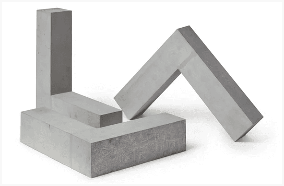
Fig. 01 · Mughal painting was studied and cut as well — scale complexity too high to componentise at UI size.
The system across the app
Every screen from the same prompt vocabulary, style rules and colour tokens.

Isolate, deconstruct, combine, curate. Each style generated in pure form first, so I knew exactly what I was overriding when they fused.


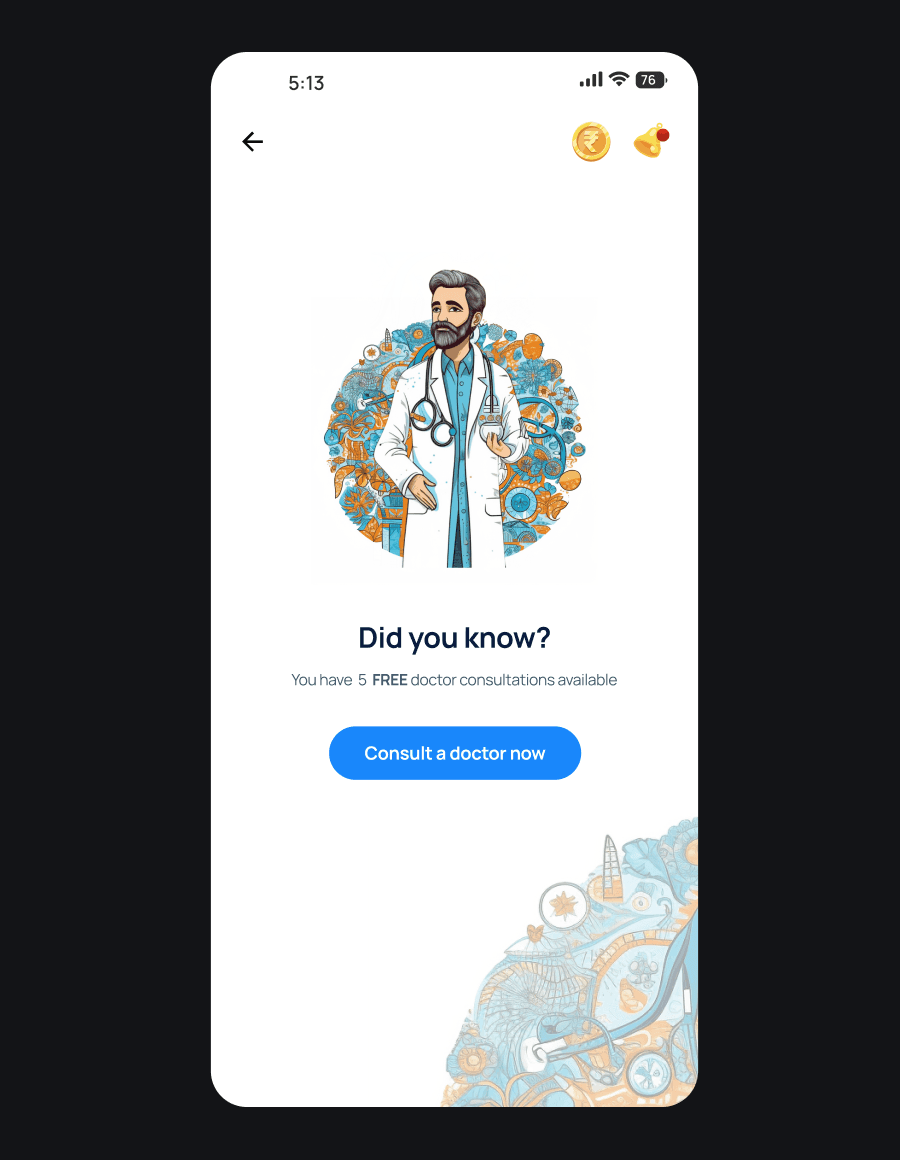

Splash
Onboarding
Empty State
Home Screen
Circular Madhubani-bordered frames on onboarding. Even “nothing here” screens carry the vocabulary — that is what makes it a system rather than a folder of images.
The deliverable was a documented prompt vocabulary, colour tokens traced to the Mysore palette, figure and composition rules, and a quality gate — legible at 48px, componentisable, consistent with the set. Hundreds were generated and most did not clear it. The system was consistent enough that a designer who isn’t me could extend it.
The ending
Signed off, then scrapped
Both founders approved it — genuine creative alignment, not polite nodding — and the system was signed off to roll out across the full product. Then the project was cancelled for business reasons unrelated to the work.
It had a downstream cost. The homepage redesign running in parallel was meant to ship in this language; without it, those screens went out in the old visual identity and the innovation had to go into structure instead.
The honest gap: cultural resonance was validated with founders, not with policyholders. Testing with actual users is the step this project never got to.
AI generates. Designers decide.
Next project
Get in touch